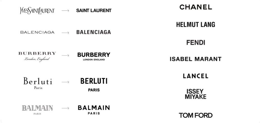
For the last three years, we’ve seen many brands (mostly high fashion and luxury) such as Saint Laurent, Balenciaga, Burberry, and many more, started to simplify their logos. Yves Saint Laurent swapped its skinny logo into a bold and large “SAINT LAURENT.” Burberry changed its Serif font for an almost identical Sans Serif type as Saint Laurent’s. Balenciaga did away with its super-thin font in favor of bolder, block letters, and Balmain moved away from its stylized to a bold Sans Serif type. This trend is to design the logo not to stand out at all, but to blend in.
But why blanding? Quoting a Creative Director of Base Design, an international design, communications, audiovisual, copywriting, and publishing company founded in New York, that blanding has largely been attributed to the desire of brands to use the same logo more seamlessly across multiple formats – i.e., on Instagram, billboards, even shopping bags. This is also in line with the current condition where social activities are being limited and the rise of online marketplace which gives tremendous design challenges. Today, the percentage of luxury goods sales are occurring online, where labeling tends to be clearer than it is in store, and this has had a practical impact on the need for – and the utilization of – logos. Brands have opted for the straightforward, easily-transferable, and super-scalable logo.
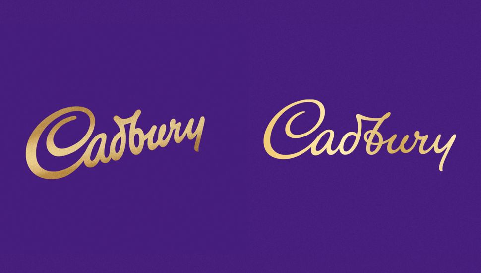
Not only in high fashion and luxury brands, but the blanding trend is followed by consumer goods and tech companies as well. In April 2020, Cadbury paid an agency one million pounds (about 18 billion Rupiah) for blanding their logo. The former Cadbury typography logo was inspired by its hand sign founder, John Cadbury. The reason Cadbury blanding their logo although the design is good, there's something that is missing on their “messages” in today's era.
Everyone knows that chocolate makes you gain weight, and of course, that's not the message that Cadbury wants to deliver. With a thin logotype, Cadbury wants their chocolate to be elegant, exclusive, warm, intimate, and sincere. Not only that, the gold gradient on the current logo is softer than before to make it more modern. While the glass and half of Cadbury were also redrawn and added in detail so that it is not very plain to communicate that Cadbury's chocolate-making process is very careful. Brand identity will impact the customer decisions and perception towards the brand, and brands with a global scale know about it so they would pay such a price for their logo designs.
So what do you think about this blanding trend? Do you know of any other brands that has taken similar approach? Leave your comments below.


